









Key Takeaways
- Every empty screen should tell users what happened and what they can do next.
- First-use, no-results, completed, permission, offline, and error states require different messages.
- A short headline, brief explanation, and one specific action are usually enough.
- Loading, empty, and error states must remain separate.
- Accessibility and testing matter as much on empty screens as they do on content-rich ones.
Mobile screens with no content are often the first impression users have of a feature. A new dashboard, empty cart, saved-items list, or inbox can either make people wonder whether something failed or show them exactly where to begin. Reviewing empty state UI patterns can help teams see how a small amount of guidance turns an otherwise blank view into a useful part of the product.
An empty state is not automatically a problem. It may mean that a user has not added anything, that a search returned no matches, that a task queue has been cleared, or that content could not load. The design goal is the same in each case: explain the situation in plain language and make the best next step easy to take.
Why Empty States Deserve More Attention
Teams often spend most of their design time on the ideal populated screen. Yet users regularly encounter zero-content views while setting up an account, filtering a list, finishing work, or recovering from a connection problem. A plain “Nothing here” message leaves important questions unanswered: Is this normal? Did the search work? What belongs here?
Empty states can teach, reassure, guide, or help users recover. Treat them as part of the core task flow rather than leftover space. When the screen has one clear job, users are less likely to back out, retry random controls, or assume the feature is unavailable.
Start by Identifying the Type of Empty State
Before choosing an illustration or writing button copy, identify why the screen is empty. The reason determines the message and action.
- First use: The user has not created, saved, or added anything yet.
- No results: A search term, filter, or location produced no matches.
- Completed: The user cleared an inbox, task list, or queue.
- Permission: The feature needs device access or an account connection.
- Error or offline: The app could not retrieve or refresh content.
Using a single generic message for all these situations creates confusion. “No items yet” may be appropriate for a new collection, but it is misleading when the actual problem is a failed request.
Give the Screen a Clear Job
Choose one primary purpose for each state. A first-use screen should help people begin. A no-results screen should help them broaden or revise the search. An error screen should provide a recovery path. A completed screen can simply confirm success and let people continue naturally.
Keep the screen in context by retaining the page title, navigation, tabs, and relevant controls where possible. The user should understand which area they are viewing and what will change as a result of their action. Avoid replacing the entire product with a poster-like message unless the task truly cannot continue.
Build a Simple Content Structure
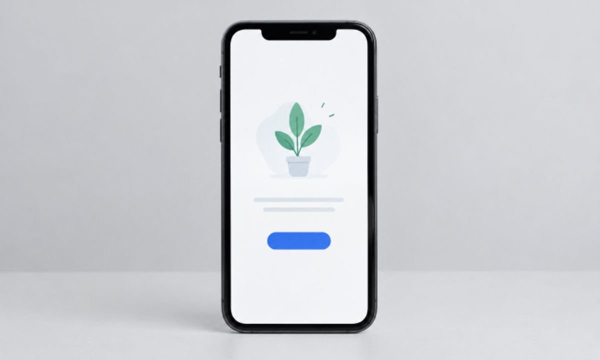
A reliable empty state usually presents information in this order:
- Visual cue: Use an icon or illustration only when it reinforces the meaning.
- Short headline: Name what is happening, such as “No saved items yet.”
- Helpful explanation: Clarify what will appear here or why it is unavailable.
- Primary action: Offer the most useful next step with a specific label.
- Secondary option: Add settings, help, or an alternate route only when necessary.
Decorative visuals should never compete with the explanation or action. If an image carries important meaning, provide a useful text alternative. Strong web accessibility practices also mean users should not need color, imagery, or gesture alone to understand the state.
Write Copy That Reduces Uncertainty
Good empty-state copy is direct, calm, and specific. Name the missing content, describe the cause when it is known, and tell users what an action will accomplish. Avoid blaming people for conditions they did not create.
Useful Copy Formulas
- First use: “Your saved items will appear here. Add one to get started.”
- No results: “No matches found. Try a shorter search or clear a filter.”
- Completed: “You’re all caught up.”
- Error: “We couldn’t load this list. Try again.”
- Permission: “Allow location access to show nearby options.”
Replace vague buttons such as “Continue” and “Okay” with verbs that describe the result: “Create Project,” “Add Item,” “Clear Filters,” “Open Settings,” or “Try Again.”
Separate Loading, Empty, and Error States
Do not show an empty message while a request is still in progress. Loading means the app is waiting. Empty means the request succeeded but returned no content. Error means the request failed. Each state needs its own visual treatment and language.
- Use a loading indicator or placeholder while content is being requested.
- Show the empty state only after a successful response contains no items.
- Provide retry or recovery controls when a request fails.
- Test slow responses, disabled network access, empty responses, failures, and normal populated results.
Design for Accessibility and Readability
Use readable text, sufficient contrast, clear focus order, and tap targets that are comfortable on a mobile screen. Keep instructions brief enough to scan without excessive scrolling, and test larger text settings, narrow widths, light mode, and dark mode. People using a screen reader should hear the headline, explanation, and action in a logical order.
Common Mistakes to Avoid
- Showing a blank page with no explanation.
- Using identical copy for first use, no results, and technical failures.
- Offering several competing actions when one next step is obvious.
- Describing a problem without giving users a way to proceed.
- Displaying an empty state before data finishes loading.
- Hiding navigation and making users feel trapped.
- Using humor when people need clear recovery instructions.
A Practical Review Process
List every screen that can contain zero items, then document why each one might be empty. For each state, define the user’s best next action, draft a short headline and explanation, and verify that the button delivers the promised result. Finally, test the experience with realistic content, failures, and accessibility settings.
How to Measure Whether It Works
Track whether users tap the primary action, complete the task, return to the previous screen, or repeatedly encounter the same state. Combine those signals with usability feedback and support questions about missing content. Testing clearer labels, shorter copy, or a better recovery route can reveal whether the screen is helping users continue.
Final Checklist
- Does the screen explain why it is empty?
- Can users tell what belongs there?
- Is there one clear, useful next action?
- Does the action label describe what will happen?
- Are loading, empty, offline, and error conditions distinct?
- Can users understand and operate the screen with accessibility settings enabled?
Conclusion
A mobile empty state should not feel like a dead end. It should explain the situation, preserve context, and guide users toward a meaningful next step. When these small screens receive the same care as the populated experience, the product feels clearer, calmer, and easier to use from the first tap.